top of page


NOVACARE
Relieving the pressure of allergy symptoms through innovative, patient-centered medications.
Developed a brand identity and website that reimagined pharmaceutical branding with a more approachable look for an fictional allergy medication company targeting adults 35–65. The identity is a metaphor inspired by the ocean’s shift from crushing depths to surface relief, the visual system balances medical authority with human empathy.
Brand Identity, Packaging Systems, Digital Experience Design


THE IDENTITY
An identity that inhales and exhales with life
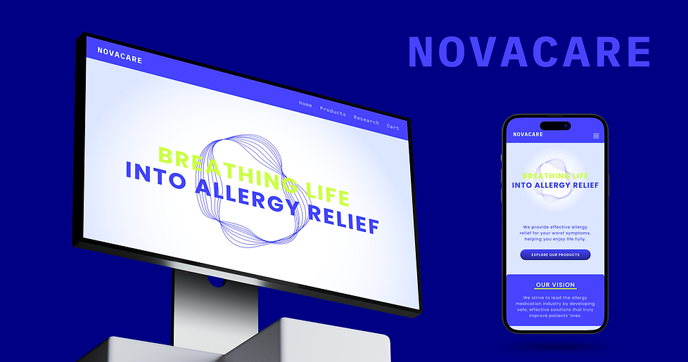
The brand system sets Novacare apart from sterile pharma aesthetics with flowing logomark lines evoking breath, gradients shifting from deep blue to coral and lime, airy Poppins typography, and photography moving from blurred to crisp to reflect the journey from disorientation to relief.


Modern, energetic web platform that redefines pharmaceutical digital presence
WEBSITE


Like what you see?
Let's Chat!
bottom of page